‹ All examples Humble 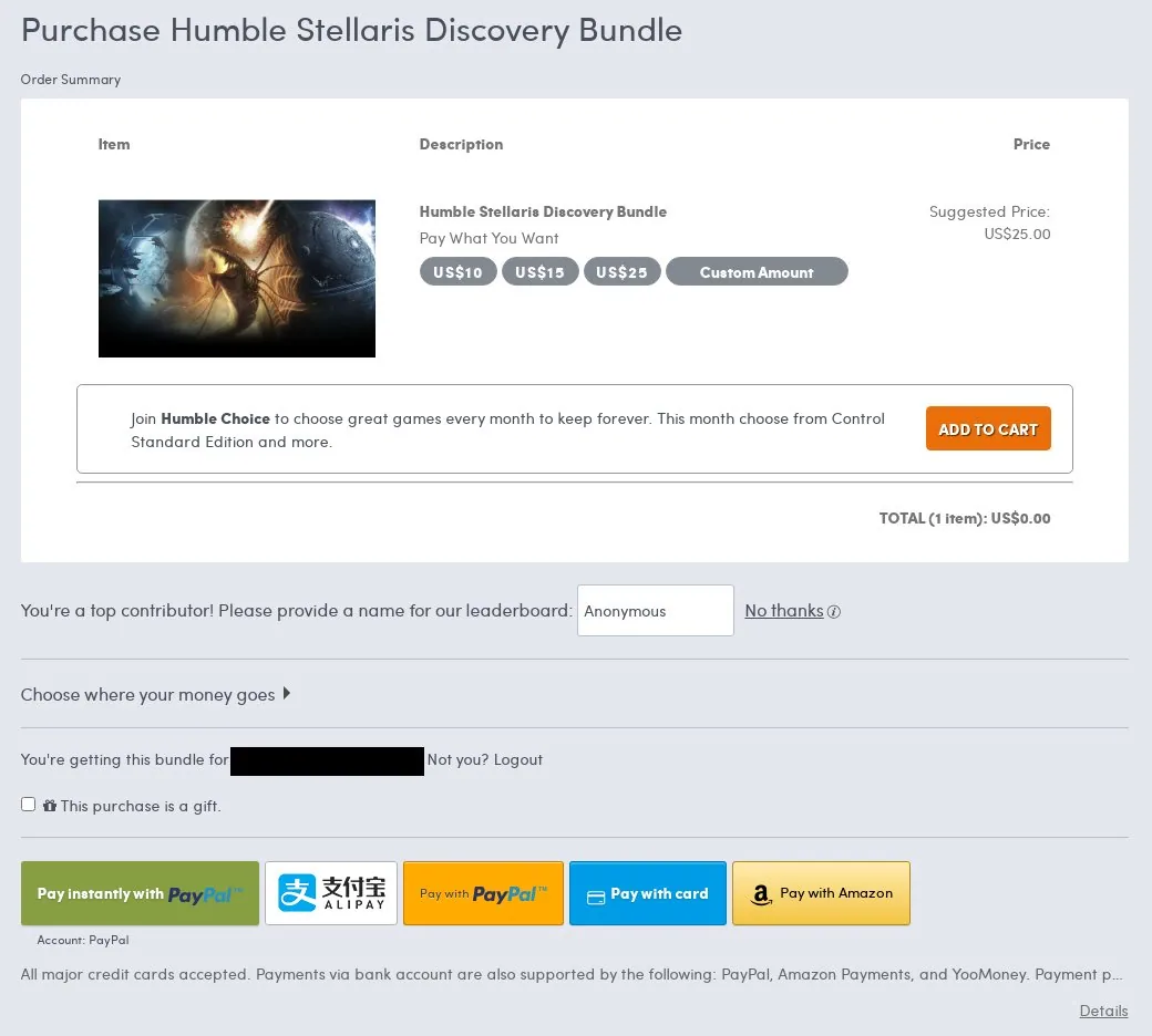
Humble: placement of ‘Add to Cart’ button.
“Really disappointed in @humble for this UI design. The “add to cart” button adds a monthly subscription but is strategically placed to make users believe it will just get them the bundle instead. Not cool, @humble. You should be ashamed of yourselves.”
Disclaimer: examples in the Hall of Shame are generally drawn from public submissions and cited sources; they have not been independently verified and may contain inaccuracies. They are presented as illustrations of design patterns, not findings of fact, unlawful conduct, or intent.